Creating a visual identity and landing page for Precision Leak Detection
Designing a visual brand identity and landing page from scratch for a new local business, from initial concept to interactive prototype.
My role
Digital designer
Tools used
Figma, Adobe CC
Project timeline
8 weeks
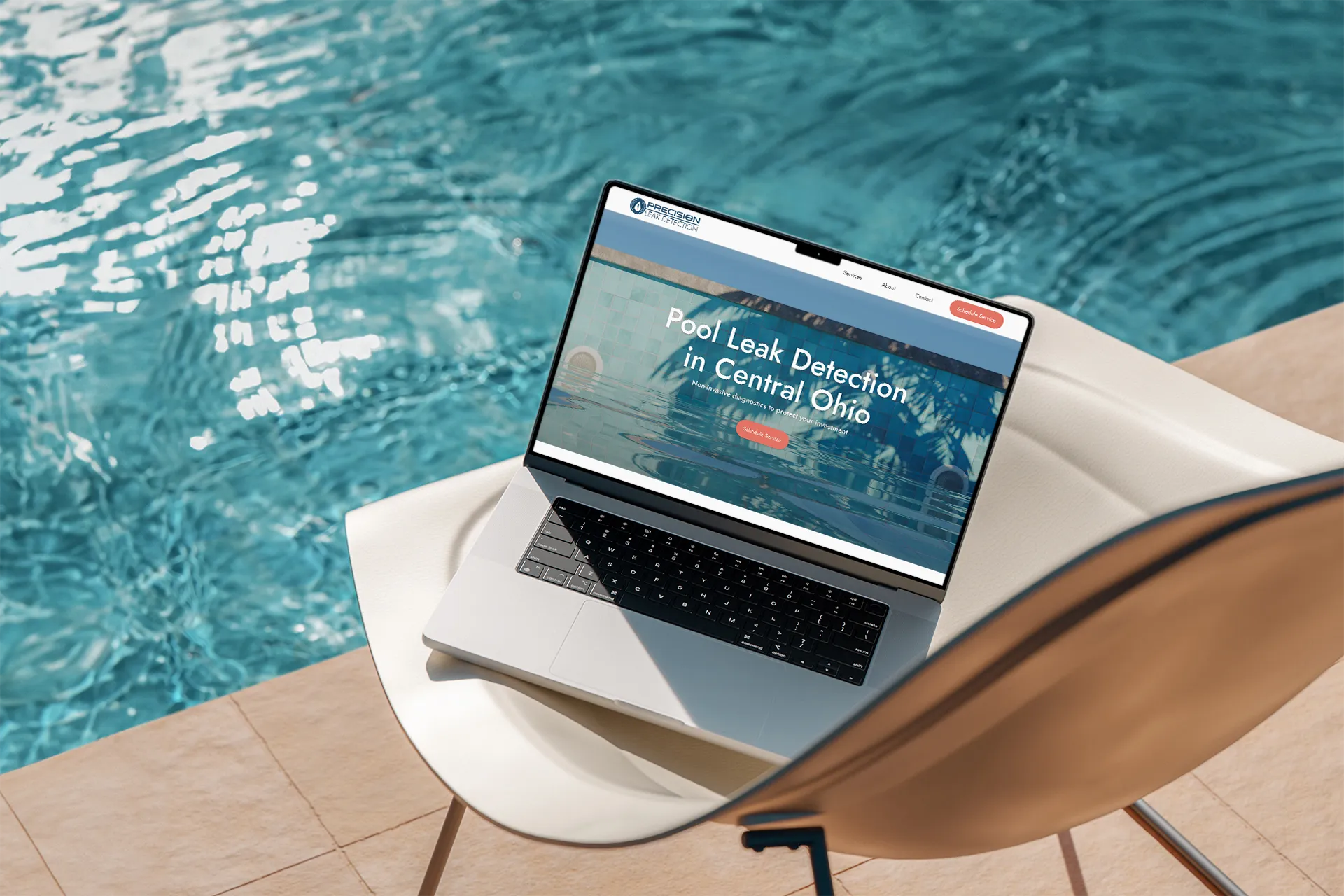
Challenge: No digital footprint
Precision Leak Detection, a brand-new venture specializing in high-accuracy swimming pool leak detection, needed an online presence to signal their credibility.
While the founders brought over a decade of combined experience, they were starting from digital scratch: no branding, no website, and no social proof.
As lead designer on a university capstone team, I led a collaborative effort to create a visual identity while independently designing their conversion-driven landing page for prospects to schedule service.
Research: The importance of credibility and trust
Industry | Competitors | Audience |
|---|---|---|
Pool leak detection is a high-trust, essential service: technical credibility signals authority and competence to prospects. | Local pool service sites skew blue-collar, utilizing contractor-style imagery—an opportunity to differentiate with a premium presentation. | Pool owners are high-intent and trust-driven, with professionalism, guarantees, and transparency as primary decision factors. |
Following an initial briefing with the founders, I set out to understand what prospects expected from service providers in the field.
First, I researched the pool, hot tub, and spa industry, as well as local competitors to establish a strategic baseline and identify opportunities for differentiation.
Then, I researched the concerns and priorities of pool owners, finding that they primarily sought professionalism, transparency, and guarantees.
While Precision Leak Detection utilizes industry-leading technology, providing the technical weight to distinguish them as an authority, an important question remained: without social proof, how do I establish trust through design alone?
Style: Laying the visual foundation
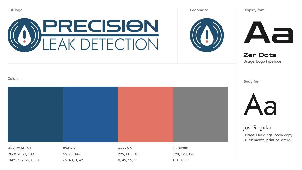
The company required a visual identity that felt as credible as the founders.
As a team, we collaborated on the brand's visual identity, while iteratively testing and validating choices with the founders.
The founders needed a palette that reflected their professionalism: deep blues to signal trust and reliability, with a coral accent to draw attention to key details.
For typography, we paired a geometric brand typeface, Zen Dots, for logo concepts, with a legible, modern font, Jost, for web and print usage.
With color and type approved by the founders, I developed a logo concept around a water droplet, a common symbol in the industry.
With the visual foundation confirmed, my focus shifted to designing the layout itself.
Wireframing: Creating a thoughtful layout through iteration
Equipped with research insights and an established visual direction, I began developing the website's layout, content hierarchy, and copy strategy.
With the company in its early stage and working with limited content, I prioritized clarity and reduced cognitive load, informing a one-page layout—a landing page—that quickly informs prospects while addressing why they should be on the site and not a competitor's site.
In one page, all information is easily discoverable, but that required me to thoughtfully sequence each section to guide prospects from awareness, to credibility, to conversion.
To ensure each decision aligned with the founders’ vision, I presented low- and mid-fidelity wireframes (desktop, tablet, and mobile) during bi-weekly design briefings, which served as validation checkpoints and feedback opportunities.
With a simple, scannable structure established, the challenge remained: the page still lacked social proof, meaning everything had to pull extra weight—restrained aesthetics, thoughtful micro-interactions, and concise copy had to do the work that testimonials normally would.
Prototyping: Listening, adapting, and refining
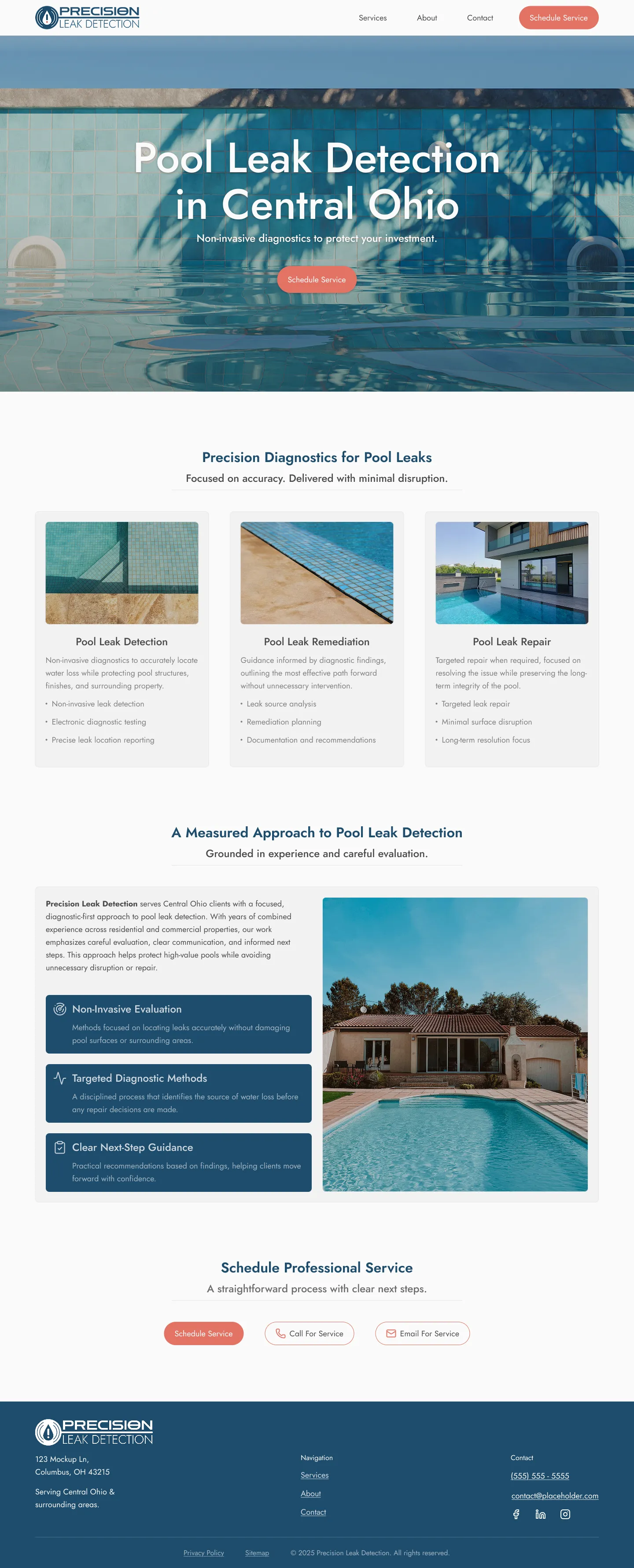
To inform micro-interactions and the interactive quality of the page, I conducted informal usability observations with non-designers, synthesizing findings into actual interactive components.
Following the 60-30-10 rule, I implemented coral as a consistent action color across CTA buttons and interactive elements.
Through ongoing founder feedback, the final copy evolved into tight, concise messaging tailored to the founders’ expertise and optimized for local search terms.
Aligning with the founders' preference for imagery that felt premium rather than "blue-collar," I selected stock images of expensive pools, reflecting the value of the investments the company protects.
With everything finalized, all that remained was presenting the work and hoping it would resonate.
Outcome: A clear favorite
At the end of the 8-week engagement, the founders selected my team's work as their preferred direction over a competing team's.
Both founders praised our work, with one co-founder stating, "you took us from a concept to something I just can't put my head around," and the other praising our consistent attention to and application of feedback.
At the discretion of my university, these designs ultimately weren't implemented, though the founders left no doubt about their ksatisfaction with the work.
My takeaway
The value of close, continuous stakeholder communication is irreplaceable. Listening to real people and their insights isn't just part of the process, it's essential to create a solution that serves others.
Leading a design team in this client-facing context pushed me to grow as both a designer and collaborator, confirming that communication, adaptability, and leadership are as integral to good outcomes as designs themselves.
Other projects

Can penguins fly?
A simple children's edutainment animation, asking the question on everyone's mind: can penguins fly?
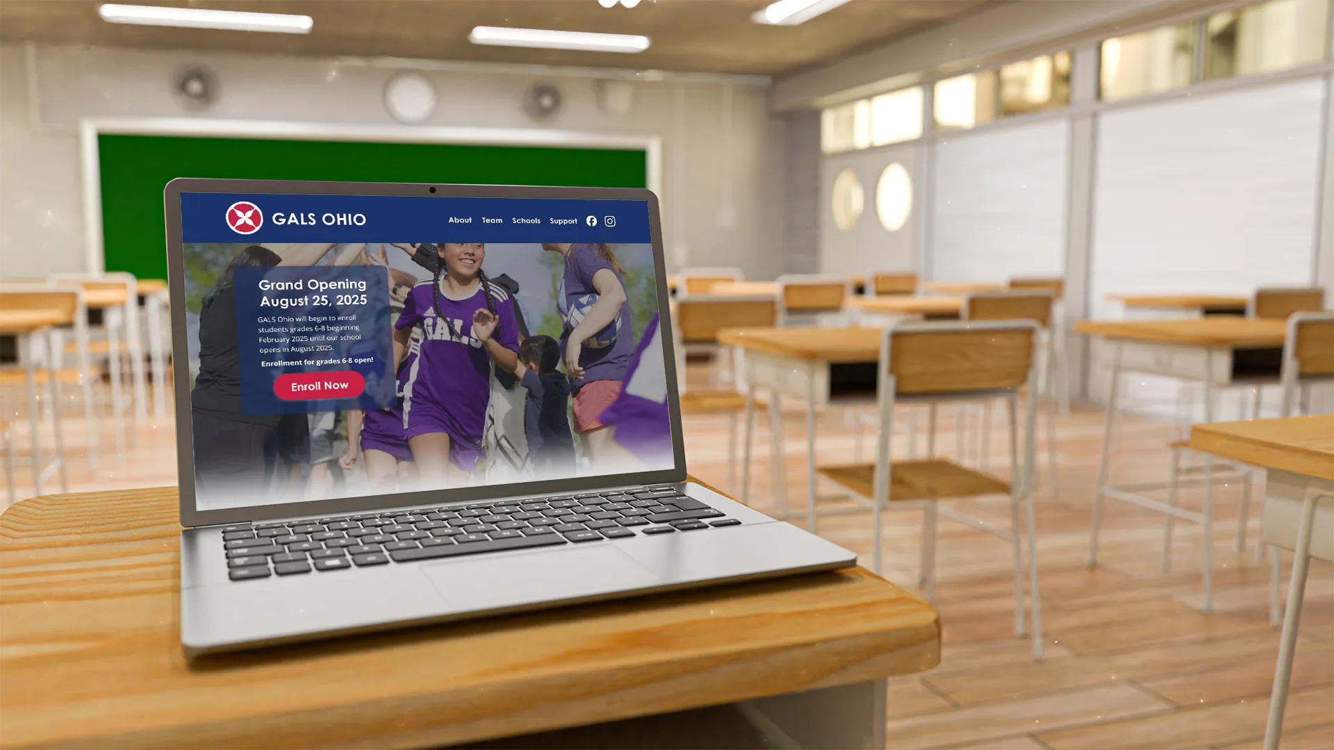
Designing a regional identity and landing page for GALS Ohio
As GALS Ohio prepared to open, they needed an enrollment-focused landing page that established a localized Ohio identity for prospective families.