Creating a Conversion-Driven Landing Page for Precision Leak Detection
Precision Leak Detection is a newly founded pool leak detection company serving Central Ohio. While the founders brought years of industry experience, they had no existing brand or website to support the business.
Role
Digital Designer
Project Type
Capstone
Client
Precision Leak Detection
Prototype
The Challenge
This was a true zero-to-one design problem. Precision Leak Detection needed a brand identity and landing page to establish credibility and drive service scheduling, without relying on reviews, testimonials, or other forms of social proof.
No existing brand identity or web presence
Operating in a high-trust industry where credibility is essential
The Solution
I designed a trust-building, conversion-driven landing page that establishes Precision Leak Detection’s identity and communicates professionalism and expertise. The design emphasizes clear content hierarchy, thoughtful interactions, and accessibility to help users feel confident taking action.
Research & Discovery
Understanding the audience was critical. Pool leaks can be costly and stressful, and pools are high-value investments. This insight shaped a design approach focused on trust, clarity, and reassurance.
Through bi-weekly meetings, I aligned with the founders on tone, messaging, and business goals. Additionally, I reviewed competitor websites to establish a baseline and identify opportunities for differentiation in visual identity and messaging.
Key Insights
Signal credibility immediately through layout
Communicate expertise clearly in place of testimonials
Highlight non-invasive detection technology as a key differentiator
Design Approach
I prioritized trust and conversion by focusing on a simple, frictionless layout and a restrained, modern visual style. I designed the layout responsively from the start to ensure consistency across device breakpoints.
Accessibility informed contrast, typography, and interaction decisions throughout the process. Early on, I also developed a reusable component library in Figma, including navigation elements, buttons, and cards, to maintain consistency and support efficient iteration.
Wireframes & Iteration
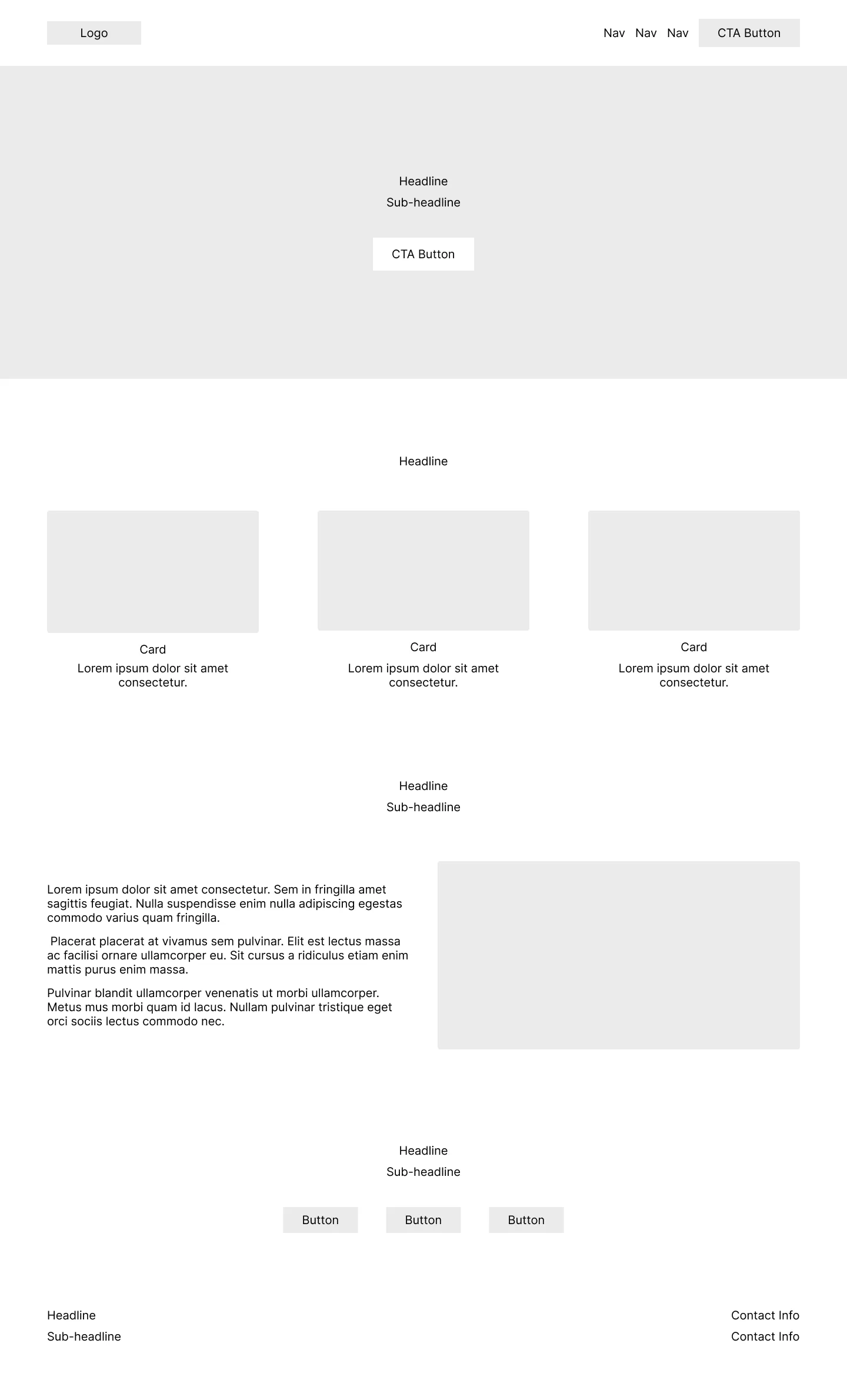
Initial low-fidelity wireframes focused on structure and hierarchy, while mid-fidelity wireframes introduced typography, spacing, and components.
Low-Fidelity Wireframes


Mid-Fidelity Wireframes


Low- and mid-fidelity wireframes across desktop, tablet, and mobile.
High-Fidelity Design
High-fidelity wireframes refined color, interactions, and introduced imagery.
High-Fidelity Wireframes


High-fidelity wireframes across desktop, tablet, and mobile.
Layout
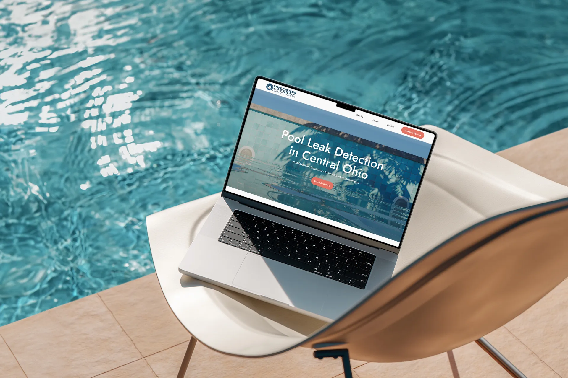
The hero section introduces the company’s mission and identity immediately, with a clear and prominent call-to-action.
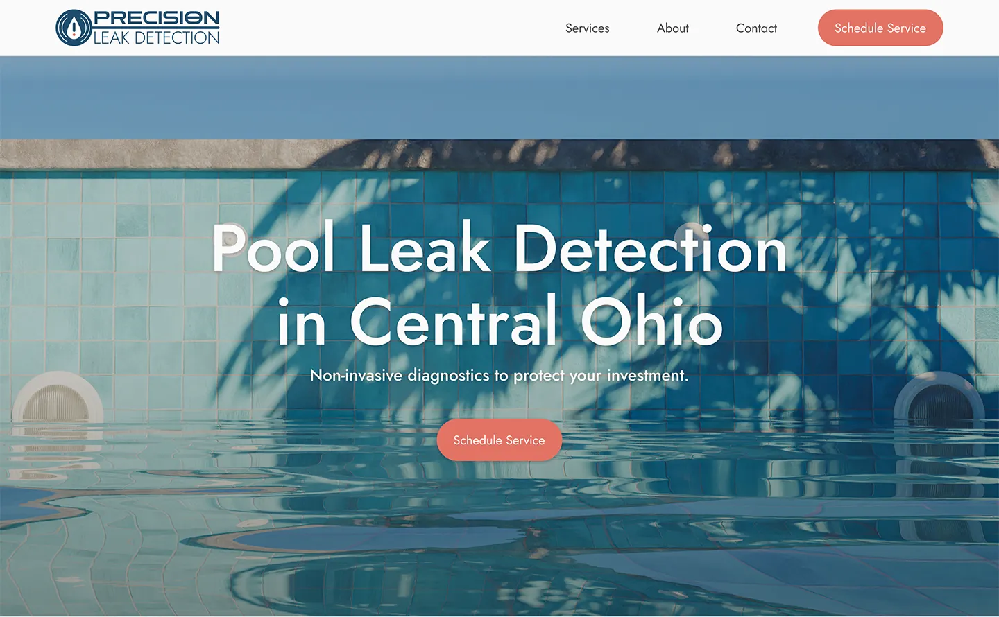
Conversion-driven hero section emphasizing a clear call to action.
Services are presented using a clean card layout that highlights key strengths.

Services section.

About section.
Professional experience and a diagnostic-first approach are highlighted, reinforcing credibility.
The footer repeats the call-to-action and includes phone and email contact options where users expect them.

Reiterated CTA, contact, and footer section.
Style Guide
I created a style guide in Figma to define color, typography, and spacing standards. This ensured visual consistency across screens and supported both efficient iteration and future handoff.
Color Palette
Typeface
Jost
Heading 2
Caption
Logo
Logotype

Logomark
Conclusion
This project gave me the opportunity to design from the ground up for an early-stage company. By the end of the semester, the founders recognized the work as among the strongest in the cohort and expressed appreciation for my responsiveness and attention to feedback.
While the design was not ultimately implemented, the founders’ approval reinforced the value of clear communication and close stakeholder collaboration. Overall, this project strengthened my skills in design thinking, responsive design, and working with real-world clients.